A single-page landing for a modern coworking space targeting freelancers and remote workers. The brief: a warm, inviting design that communicates amenities and location in under ten seconds of scroll.
New coworking spaces struggle to communicate three things quickly: what they offer, why it feels better than the next one, and where they are. The client needed a single landing page that answered all three without overwhelming the visitor.
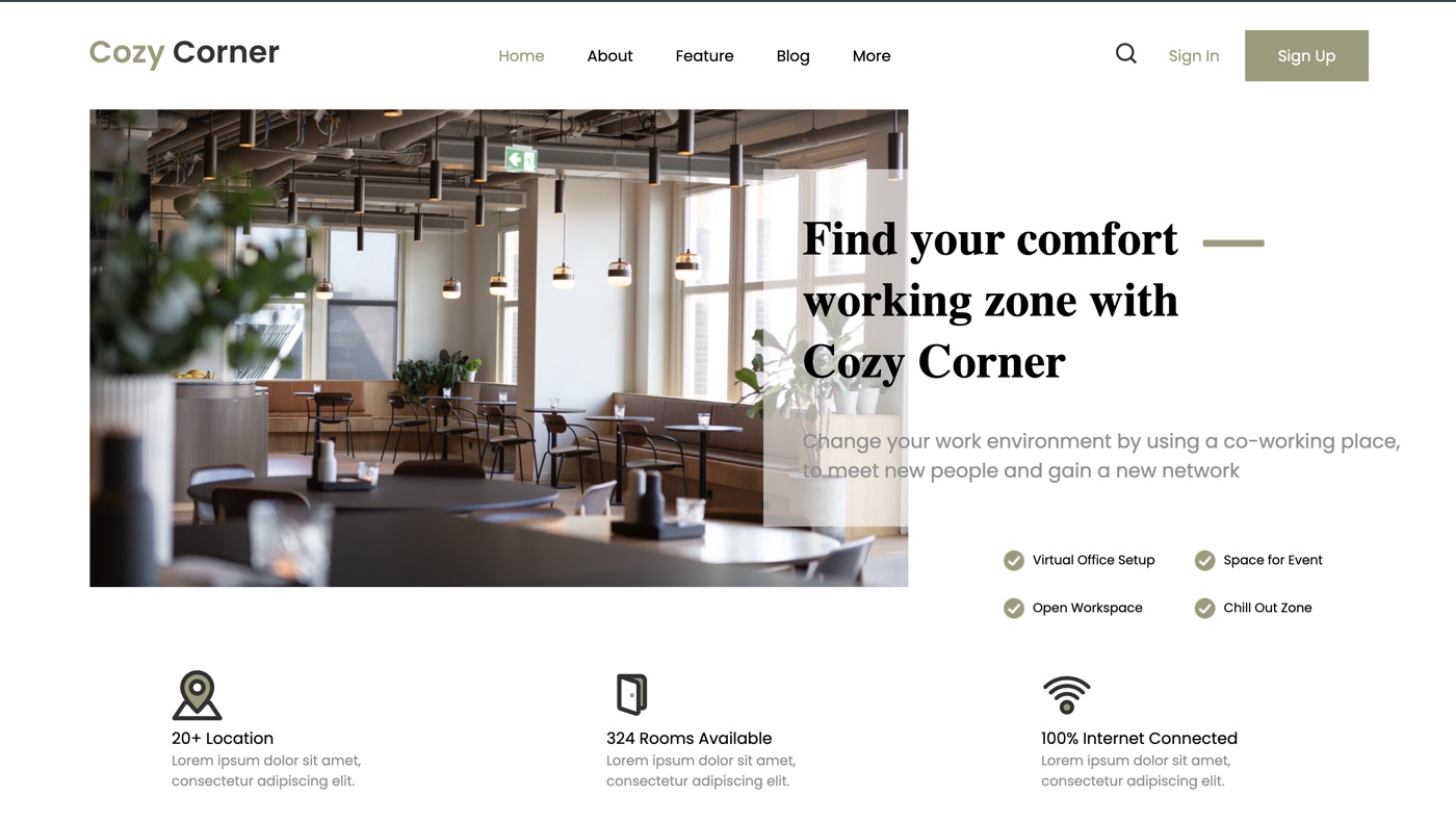
I chose a warm, earthy palette to separate the brand from the typical sterile coworking look. The hero opens with a single strong headline, followed by a stats strip (open hours, members, seats) and a feature grid highlighting amenities.
Location gets its own section with a large visual anchor. Every section ends with a CTA that leads to the enquiry form, so visitors never have to scroll back to book.
Stands out from sterile coworking sites.
Hours, members and seats at a glance.
Responsive grid with icons.
Dedicated section with strong visuals.
Built with HTML5, SASS and Vite. Fully responsive, optimized images and semantic markup — perfect foundation for future additions like a booking system.
Next project